
my food blog will be discontinued. i realize i have a tummy. a very bad big ugly unhealthy tummy. it is appearing all over facebook. argh. i am going to have to cut down on my butter consumption (oh man, but i love butter) and eat lots of yoghurt. so unless you want to see yoghurt everyday on my blog, i think i better move on to something better.
i shall begin my architecture blog. please visit my blog for the latest updates on an aspiring architect's life and inspiration (i realize this will probably cast my blog viewership down to nearly zero, besides a few faithful people who visit my blog no matter how boring it gets). i love you guys. *muahmuah*
the day started with me deciding to visit a popular kl tourist destination near daddy's office. it's called central market. mummy says its a really nice place to visit, and thinks it's a prime example of successful adaptive reuse, but then she didn't use that term lah. haha.
it's very cool!
 since 1986. you can check out some of the pics here of the building before it was adapted-re-used.


 image via archnet
this was before the renovations
 a stage for cultural activities
 the walkways are about 7feet wide, very comfortable and you don't feel jammed in even when there are quite a few people on the walkway.
 the annexe
 i found a place called t-square here which is a bit like art friend but not so big :)
 globalisation?
 i liked this lift. it's rather an interesting fellow. sticking out of nowhere like that. the architect wanted to break up the space at the central mall with it's glazed skylight and thus he put a deliberately contrasting lift core sticking up like a (sore) thumb there as an architectural focal point.
 image via archnet
see the semi-circle thing on top!
 these shirts are really funny! i wasn't supposed to take photos though. but i didn't realize until i took this pic. so here you are. blow it up and enjoy.
 another illegal one. i didn't take anymore. i am a good citizen.
 i took this from the third storey. i think it looks very cute. like polypocket.
um. i realize i didn't take very good photographs. i should have taken one of the roof, and then you could see how it was adapted-re-used properly. but i have limited card space. sorry.
 closest i can give for you to compare.
 photo via archnet
this is how it used to look. now it is a successful tourist destination, and it's so nice and comfortable to walk around in...great example of how an old building has been re-used. i like also that the original building designed by architect TYLee was designed to enable a third storey. it's good that the architect kept in mind that extensions may have to be made in the future. cool stuff.
later on, i went to the klcc convention centre to attend kldf09. speakers were Neil Thomas of Atelier1, Andrew Grant of Grant Associates, and MeeJin Yoon+Eric Howeler of MY studio. The topic was biomimicry. i wish i signed up for datum now. but it's a bit expensive for me, even the student price is rm260. sigh. i want to see the husband and wife duo of MY studio again. they are, to put it mildly "damn smart lah".
 pardon the red thing. i was trying to take photos discreetly. it's the seat in front of me. luckily no one sat there.
but i shall begin with Neil Thomas of Atelier 1, as he was the first speaker. guy came in a white T-shirt and blue jeans, looking really shagged next to the other, better dressed people. but he is also "somewhat damn smart lah". he's an engineer, but an engineer i admire, who goes, yeah hey let me figure out solutions to do that great design...rather than those who say, eh, it can't be done leh...
well, i don't like the esplanade very much (it's not only ugly, the shades have to be manually cleaned leh). but it's an attempt to design in such a way that it harmonizes with nature rather than being a regular i want my building to sit here and if it's hot i put loads of air con and that be it. so attempts are always good, even if it fails, because failure's are stepping stones to success. i guess. they did do alot of research on sunpaths and materials so that they could decrease the airconditioning load by 1/3 that of a normal building. so that is good. if they could make a prettier and less death inducing (i think some cleaner or other must have fallen off the rooftop cleaning before. i betcha, i betcha) building next time using the knowledge gleaned from this project, i forgive the esplanade. (who am i to speak like this nyways, haha) anyway, it was dp architects who designed it, not atelier1.


image via artsauthority
he also mentioned how they helped anish kapoor make his big domed thing...i mean Cloud Gate. you will not believe the structure inside. this one was inspired by a shell's ribbed structure.
then he spoke of some interesting bus shelters also inspired by a shell's ribbed structure, and a weird grasshopper looking thing inspired by the skeletal system of a human being. weird. and and plastiki, which is very nice, because they used recycled (i hope) plastic bottles to make a boat. but you ain'ts seen nothing yet.
i shall begin my architecture blog. please visit my blog for the latest updates on an aspiring architect's life and inspiration (i realize this will probably cast my blog viewership down to nearly zero, besides a few faithful people who visit my blog no matter how boring it gets). i love you guys. *muahmuah*
the day started with me deciding to visit a popular kl tourist destination near daddy's office. it's called central market. mummy says its a really nice place to visit, and thinks it's a prime example of successful adaptive reuse, but then she didn't use that term lah. haha.
it's very cool!
 since 1986. you can check out some of the pics here of the building before it was adapted-re-used.
 image via archnet
this was before the renovations
 a stage for cultural activities
 the walkways are about 7feet wide, very comfortable and you don't feel jammed in even when there are quite a few people on the walkway.
 the annexe
 i found a place called t-square here which is a bit like art friend but not so big :)
 globalisation?
 i liked this lift. it's rather an interesting fellow. sticking out of nowhere like that. the architect wanted to break up the space at the central mall with it's glazed skylight and thus he put a deliberately contrasting lift core sticking up like a (sore) thumb there as an architectural focal point.
 image via archnet
see the semi-circle thing on top!
 these shirts are really funny! i wasn't supposed to take photos though. but i didn't realize until i took this pic. so here you are. blow it up and enjoy.
 another illegal one. i didn't take anymore. i am a good citizen.
 i took this from the third storey. i think it looks very cute. like polypocket.
um. i realize i didn't take very good photographs. i should have taken one of the roof, and then you could see how it was adapted-re-used properly. but i have limited card space. sorry.
 closest i can give for you to compare.
 photo via archnet
this is how it used to look. now it is a successful tourist destination, and it's so nice and comfortable to walk around in...great example of how an old building has been re-used. i like also that the original building designed by architect TYLee was designed to enable a third storey. it's good that the architect kept in mind that extensions may have to be made in the future. cool stuff.
later on, i went to the klcc convention centre to attend kldf09. speakers were Neil Thomas of Atelier1, Andrew Grant of Grant Associates, and MeeJin Yoon+Eric Howeler of MY studio. The topic was biomimicry. i wish i signed up for datum now. but it's a bit expensive for me, even the student price is rm260. sigh. i want to see the husband and wife duo of MY studio again. they are, to put it mildly "damn smart lah".
 pardon the red thing. i was trying to take photos discreetly. it's the seat in front of me. luckily no one sat there.
but i shall begin with Neil Thomas of Atelier 1, as he was the first speaker. guy came in a white T-shirt and blue jeans, looking really shagged next to the other, better dressed people. but he is also "somewhat damn smart lah". he's an engineer, but an engineer i admire, who goes, yeah hey let me figure out solutions to do that great design...rather than those who say, eh, it can't be done leh...
well, i don't like the esplanade very much (it's not only ugly, the shades have to be manually cleaned leh). but it's an attempt to design in such a way that it harmonizes with nature rather than being a regular i want my building to sit here and if it's hot i put loads of air con and that be it. so attempts are always good, even if it fails, because failure's are stepping stones to success. i guess. they did do alot of research on sunpaths and materials so that they could decrease the airconditioning load by 1/3 that of a normal building. so that is good. if they could make a prettier and less death inducing (i think some cleaner or other must have fallen off the rooftop cleaning before. i betcha, i betcha) building next time using the knowledge gleaned from this project, i forgive the esplanade. (who am i to speak like this nyways, haha) anyway, it was dp architects who designed it, not atelier1.
image via artsauthority
he also mentioned how they helped anish kapoor make his big domed thing...i mean Cloud Gate. you will not believe the structure inside. this one was inspired by a shell's ribbed structure.
then he spoke of some interesting bus shelters also inspired by a shell's ribbed structure, and a weird grasshopper looking thing inspired by the skeletal system of a human being. weird. and and plastiki, which is very nice, because they used recycled (i hope) plastic bottles to make a boat. but you ain'ts seen nothing yet.
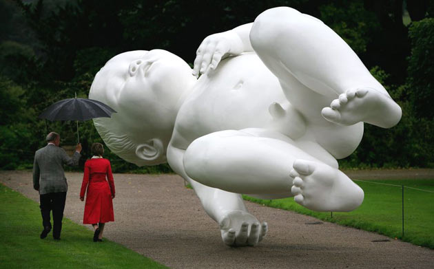
image via gardencouk
is this cool or what. leave you to guess what the structure inside looks like. hahaha. I KNOW. and i am evil.
is this cool or what. leave you to guess what the structure inside looks like. hahaha. I KNOW. and i am evil.

image via aboutbritain
also, atelier1 has worked on these quaint buildings in Haringey. it was inspired by termite mounds. termites can maintain a 30-31C temperature in the centre of their nest by having these holey things which they open and close at appropriate times. ah. you see, termites invented natural ventilation. nay, God did. hah. no wonder wisdom was the architect at His side. i crapping.
they also worked on federation square, which is also kind of ugly, but i can't say, because i have never seen the thing in person. or in building. hahaha. oh dear. but i heard it is a lovely square, and very lively and full of people, which is how a successful square should be like. that is more important than good looks. it's fascinating to learn how they generated the triangles on the facade. it involves fold lines and pinwheel generators and things. they have several materials on the facade: sandstone, glass and two types of zinc. nus is trying to copy them. the nus alumni house looks like a poor imitation.
ah. this one deserves an image. cool stuff. taratantara.

image via dbartmag
no really. it's called taratantara. and it's made of somewhat the same fairy stuff. designed by anish kapoor. we need all sorts in the world. lol, have fun wondering what the internal structure is like. HEH HEH.
loads more images at atelier1

image via andrewgrant
cool lah
second speaker was Andrew Grant of Grant Associates. He's not an architect (i think they save the architects for datum. man, i wish i had loads of money) but a landscape architect. but he's working on the gardens in the singapore marina gardens by the bay. image speaks for itself. plus i'm tired.
and finally my favourite duo, meejin yoon and eric howeler of MY studio.
they speak very well. maybe that is why i like them so much. everything they said spoke of years of research and thinking. at least, that was my impression. and i loved the fact that they were inventing their own things to make their art installations. unfortunately they did not mention much about their architecture during today's talk, cos they were keeping it for datum (sigh).
the first project they mentioned was this weird dress called the defensible dress. it is a response to the increasing encroachment of personal space in everyday life. inspired by the porcupine and the blowfish, the extents of the personal space zone are defined as a numerical distance by the wearer. useless, you say. ah. i kind of think so too. but maybe this research will lead to something else. edison made a gazillion failed prototypes before he got the lightbulb. i'm not sure how this is related.
next came a mobius strip dress. what they did was investigate how one could cut up a mobius strip and the shapes that the mobius strip became after numerous cuts parallel to the strip (this is weird, seeing that this is a single plane in a single dimension and all that). useless, as usual. still, the methamatics they did and the programs they wrote while doing this project could possibly find another usage in the future.
its kind of nice that the difference between designers and scientists is that the designers come up with an art object as a result of their studies (and as a side, books, research papers etc) while scientists come up with a research paper and that is the result (they should keep the side products, beautiful graphics etc). they are really quite the same. i wonder why there is a separation.
MY studio was also hired to design an exhibition space for an aztec empire exhibition at the guggenheim museum. if you are familiar with the guggenheim, you know that the building is a sort of rotunda and that's the space they had to work with. they catalogued the items and found that there was more items than surface. thus, they had to figure out a way to generate more surface space. they thus designed a singular linear element made of black felt of half an inch thick.
loads of interesting stuff on their webbie.
also, atelier1 has worked on these quaint buildings in Haringey. it was inspired by termite mounds. termites can maintain a 30-31C temperature in the centre of their nest by having these holey things which they open and close at appropriate times. ah. you see, termites invented natural ventilation. nay, God did. hah. no wonder wisdom was the architect at His side. i crapping.
they also worked on federation square, which is also kind of ugly, but i can't say, because i have never seen the thing in person. or in building. hahaha. oh dear. but i heard it is a lovely square, and very lively and full of people, which is how a successful square should be like. that is more important than good looks. it's fascinating to learn how they generated the triangles on the facade. it involves fold lines and pinwheel generators and things. they have several materials on the facade: sandstone, glass and two types of zinc. nus is trying to copy them. the nus alumni house looks like a poor imitation.
ah. this one deserves an image. cool stuff. taratantara.
image via dbartmag
no really. it's called taratantara. and it's made of somewhat the same fairy stuff. designed by anish kapoor. we need all sorts in the world. lol, have fun wondering what the internal structure is like. HEH HEH.
loads more images at atelier1
image via andrewgrant
cool lah
second speaker was Andrew Grant of Grant Associates. He's not an architect (i think they save the architects for datum. man, i wish i had loads of money) but a landscape architect. but he's working on the gardens in the singapore marina gardens by the bay. image speaks for itself. plus i'm tired.
and finally my favourite duo, meejin yoon and eric howeler of MY studio.
they speak very well. maybe that is why i like them so much. everything they said spoke of years of research and thinking. at least, that was my impression. and i loved the fact that they were inventing their own things to make their art installations. unfortunately they did not mention much about their architecture during today's talk, cos they were keeping it for datum (sigh).
the first project they mentioned was this weird dress called the defensible dress. it is a response to the increasing encroachment of personal space in everyday life. inspired by the porcupine and the blowfish, the extents of the personal space zone are defined as a numerical distance by the wearer. useless, you say. ah. i kind of think so too. but maybe this research will lead to something else. edison made a gazillion failed prototypes before he got the lightbulb. i'm not sure how this is related.
next came a mobius strip dress. what they did was investigate how one could cut up a mobius strip and the shapes that the mobius strip became after numerous cuts parallel to the strip (this is weird, seeing that this is a single plane in a single dimension and all that). useless, as usual. still, the methamatics they did and the programs they wrote while doing this project could possibly find another usage in the future.
its kind of nice that the difference between designers and scientists is that the designers come up with an art object as a result of their studies (and as a side, books, research papers etc) while scientists come up with a research paper and that is the result (they should keep the side products, beautiful graphics etc). they are really quite the same. i wonder why there is a separation.
MY studio was also hired to design an exhibition space for an aztec empire exhibition at the guggenheim museum. if you are familiar with the guggenheim, you know that the building is a sort of rotunda and that's the space they had to work with. they catalogued the items and found that there was more items than surface. thus, they had to figure out a way to generate more surface space. they thus designed a singular linear element made of black felt of half an inch thick.
loads of interesting stuff on their webbie.
2 comments:
wow....such a long post.. will read it again in detail in future......hahahaaha
haha, take your time :) it is too long lah.
Post a Comment